After decades in the painting business, I’ve seen trends come and go. But 2025 has something different: it’s less about following the crowd and more about creating a space that feels like you, with walls that reflect comfort, character and wise design choices.
Here are the key trends I’m seeing this year — and how you, my neighbour, can make them work in your home.
1. Warm Neutrals & Earthy Undertones
The cool greys that dominated the last decade? We’re letting those go. Design experts now say homeowners are seeking warmth — tones like taupe, greige, soft sand, or clay-tinted neutrals. :contentReference[oaicite:0]{index=0}
These colours give you a timeless backdrop and a cosy feel. I tell people: “Pick a wall colour you can live with for ten years — make it a foundation, not just a trend.”
2. Full-Room Colour Drenching
Here’s something bold: painting every surface in the room the same colour—walls, ceiling, trim, even built-ins. The result is immersive, dramatic, and surprisingly harmonious. :contentReference[oaicite:1]{index=1}
If you’ve ever been afraid of going dark or colourful, this is a safe way to make a statement without breaking decor cohesion.
3. Rich Accent Hues Over Pastel Fads
You might’ve noticed jewel-tones, deep olives, burgundies creeping back into interior paint palettes. These colours feel luxurious yet grounded. :contentReference[oaicite:2]{index=2}
However — avoid making them the entire room unless you love the drama. Use them on a single wall, a nook, or built-ins for high impact.
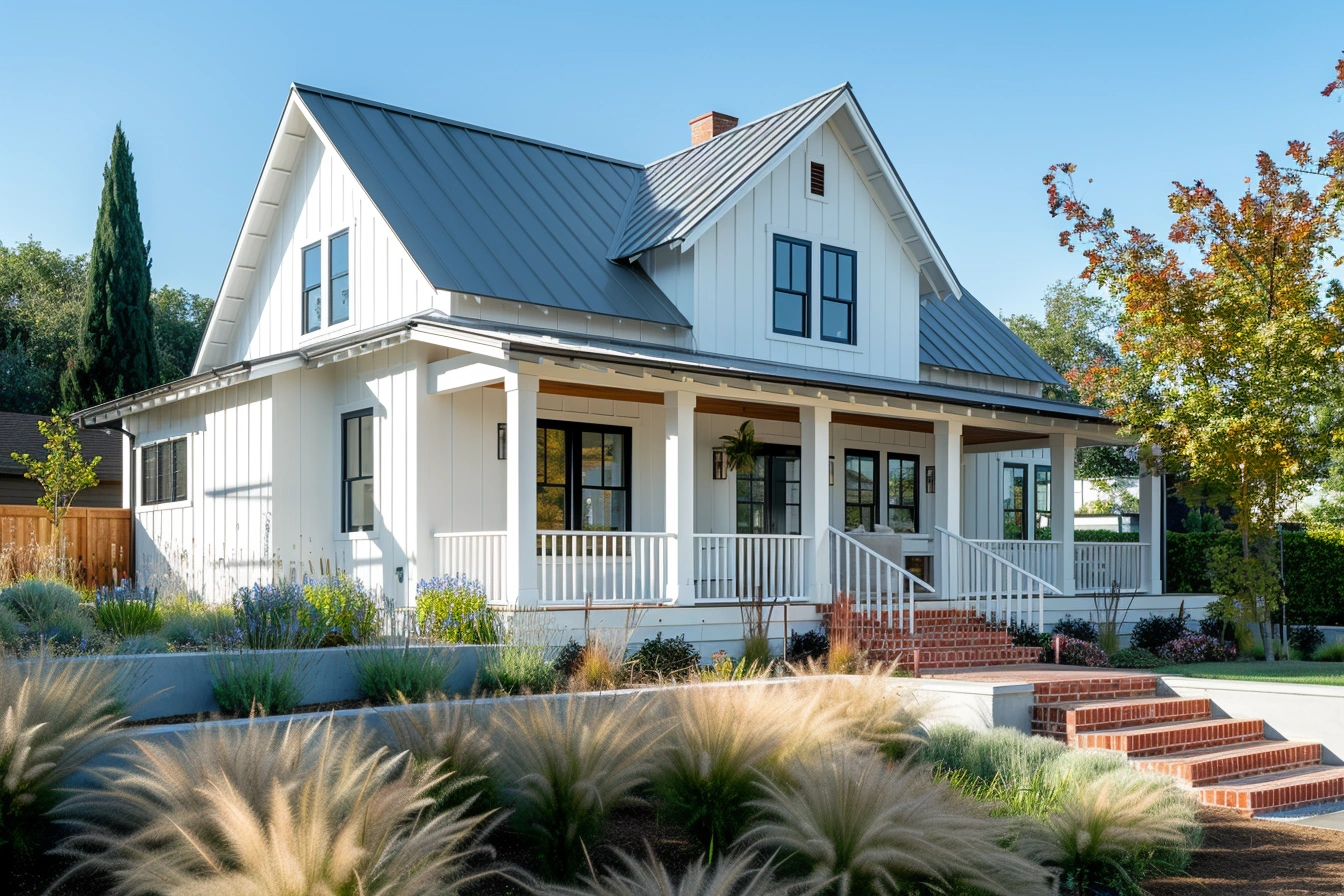
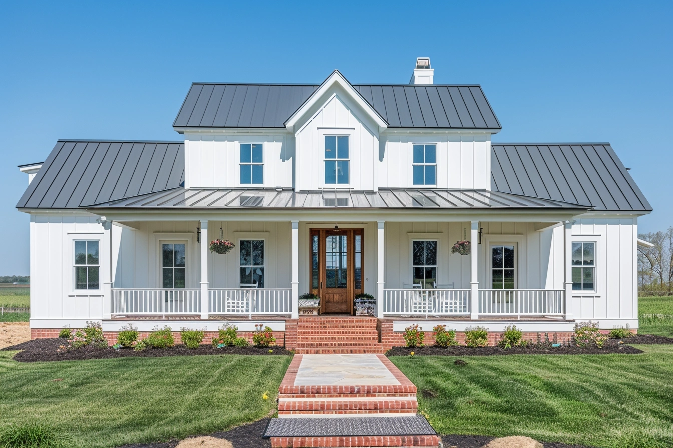
4. Warm White & Creams Over Sterile Whites
Bright clean whites are still around, but there’s a shift toward warmer white tones—creams, off-whites, whites with a hint of warmth. Designers say ultra-cool whites feel too cold and impersonal for many homes now. :contentReference[oaicite:3]{index=3}
For my clients in Lexington, KY, this means we match paint finishes to natural light angles, wood tones, and furniture — not just “white walls”.
5. Lofty Finishes - Artful Textures & Sheens
Paint isn’t just colour anymore; it’s also about finish and texture. Matte finishes that hide imperfection, satin finishes that give subtle sheen, or even architectural-finish paints for built-ins.
If you want style, consider how light hits your walls, how much the room gets used, and what kind of maintenance you’re willing to do.
✅ My Advice for You
- Choose one trend that feels right for your home and don’t chase all the trends.
- Test paint swatches in your space under real lighting—morning, midday, evening.
- Work with finishes: a rich accent colour in matte can look far more elegant than a loud colour in glossy.
- If you’re unsure: warm neutral + one rich accent colour + consistent trim/ceiling colour = winner.
If you’re ready to take your room from “okay” to “wow”, let us know at Yellowstone Renovation. I’ve got my tape, ladders, and colour charts ready.
Happy painting —
Your neighbour in the trade,
[Your Name]